Pages

Huda Beauty: Textured Shadow Palette Rose Gold Edition-- first impression/review

Tuesday, October 4, 2016

Huda Beauty has taken the makeup world by storm, in a seemingly short amount of time. Everywhere I look, I've been seeing Huda products. I have the Liquid Matte's, and really enjoy them, so I was very excited to try new items from her line.
I'll start off by saying I like this palette, I'm going to keep and work with it. It requires work. This is not a palette that you can bring on the go, not use primer or a brush, and call it a day. The shadows need work (they remind me of Bobbi Brown shadows, which I do NOT personally enjoy), but I do enjoy the color payoff once layered. They need a primer, there's no other way to put it. A primer will enable these colors to really adhere to your eyelids, and prompt a more put-together look.

I want you to have an open mind when looking at this palette. The addition to "textured shadows" is great for this line, because the top shades are extremely textures. They're rough, a little uneven, thus seemingly act as a dud. This is not the case, to me. The shades are (mostly) great on their own, and they're all great layered up with the matte shades in the palette.

I want to mention, at first glance, these shades swatched look awful. I was extremely apprehensive to pick it up, due to the inconsistency in swatching.
 
These colors need work.

I am not denying that. And for the price point, some may not bother to want to make it work, and I don't blame you. I'm extremely picky with my products, and I believe that there is so much out there, so many brands and textures and shades, that no one should settle on something based off of hype alone. I've gotten better and picking what I know I'll wear, and what I think I'll wear but will never pick up. Based on these colors, I think this can be a palette that I use often enough.
With that said, I do like this palette. Upon blending and layering, I love the looks that can be created with this palette. I think in order to get something out of this palette, you should really love the color payoff. If you only like a few colors, I'll go ahead and tell you I don't think it's worth it. To me, the colors are unique enough that I'm willing to make it work.

Let's talk more in depth about the product itself.

The packaging:
I enjoy the packing, weirdly enough.  It comes in a cardboard sleeve, and you pull the palette out, and can clearly see the shades through the top. I like that. There is a clear film that I would recommend keeping on, just for the sake of not having your colors mix, as the glitters WILL have fallout. I can see a potential issue with this palette as not being sturdy enough to withstand a drop. The magnetic closure doesn't seem as strong as I would hope, but it is not flimsy. I can see this palette not reacting well with any sort of moisture.
pros: clear plastic on top, plastic sturdy and thick, plastic sheet included to prevent fallout, optional sleeve to keep palette contained and not stained
cons: does not seem sturdy to withstand hard drops, cardboard packaging not weighted, seemingly does not withstand moisture


Price/availability
I wanted to touch on this, and will try to include this in my reviews going forward, because hot ticket items are normally a pain to acquire. This was no different. The palette will be available on Sephora's website next month, which is what I would recommend doing. Huda Beauty's website is atrocious. There were constant lags, inability to click or go to the cart, difficulty following through with the purchase. It took over an hour for me to be able to purchase mine. I tried different browsers, different devices, going incognito, but ultimately what worked best was refreshing the tab until the order went through. I'm not sure why there was so much difficulty in assuring a user-friendly checkout, especially since the release was prolonged (and then magically appeared to work out of nowhere). They were desperate to launch the product, without doing it right, and that is always a big turn off with brands. I love the accessibility and smoothness of going through Sephora,  and would always suggest going through them for security and overall ease of purchasing. Not to say I don't support buying through an individual's site, but sites like these make me very weary. Let's also talk about the price point. It's $65 dollars for 18 shades, not terrible in the grand scheme of makeup, when you break it down it's almost $4 a shadow. I'm unable to pull up how much is in each pan, but I'm assuming it's nothing more or less than a standard palette. Nothing crazy, no great deal, it is what it is.
pros: paypal accessible, quick shipping (live in US, shipped from Dubai, only a few days)
cons: non user friendly site, lagged greatly, unsecured sytem..my browser alerted me several times to not go to this site. I didn't listen 0:)


The Shades:
What really sold me, aside from wanting to try more from this brand, was the rose gold conception. I love rose gold in makeup items, I love that it's been on trend for a while now. Stepping back from the formulation or wear of these shades, they are beyond beautiful to look at. The colors on top are all glitter. There are 8 glittery/satin shades, 10 mattes. I like this array, as I think mattes help more or less to complete a look. The glitters themselves stand out. I'll go ahead and note that there is inconsistency in the formulation, something I loathe but is seemingly unavoidable with most brands.

Glitters:
The glitters are interesting, and as I noted before, very textured. Dubai, Fling, Trust Fund, Angelic and #Blessed can absolutely stand on their own. 24K and Rose Gold definitely need some sort of base to work. Before swatching the rest and playing around, I didn't like 24k or Rose Gold. After layering it with other shades, I'm in love. 24K is very similar in feel and texture to a gold flake one would put on nail or lip art, to create that essence of a textured look. I love it. It blends much more effortlessly once applied to a base coat of a shadow. I can definitely see myself adding in to the center of the lip to create a dimensional lip look as well. The glitters, to me, are all rockstars in their own ways. While the consistency is something harsh and piecey, I enjoy the finalized look to these.

Mattes:
The mattes have striking colors that I think are cultivated perfectly to the "rose gold" theme. There's some neutrals, some bolds, and the basics. All of these work well under the glitter colors in the palette, but can perform solo with some work. I think a densely packed, smaller brush would work the best in crease, outer v, etc, as the colors really need a few layers before doing something great. These are not one swatch and done colors. They need work, for sure, maybe even more than the glitters. The pigmentation is pretty on par throughout the mattes, they all need a few layers in order to look their best.

Swatches
colors (from left to right): Dubai*, Fling*, 24K, Rose Gold, Trust Fund*, Angelic, #Blessed, Bossy, Flamingo, Shy, Bae, Moon Dust, Black Truffle, Suede, Coco, Maneater, Henna, Sandalwood.
 ** are personal favorites.
~My least favorites were: Black Truffle and Flamingo.
 
The color swatches have one color swipe on top, and two on the bottom.

                Dubai (pictured above)


                Dubai and Fling (pictured above)


                                                                24K (pictured above)

                                                            Rose Gold (pictured above)

                                                           Trust Fund (pictured above)


                                                             Angelic (pictured above)


                                                           #BLESSED (pictured above)


                                            Bossy, Flamingo, Shy (Pictured from top to bottom)


                                                                Bae (pictured above)


                                  Moondust, Black Truffle, Suede, Coco (pictured top to bottom)


                                                             Maneater (pictured above)


                                            Maneater, Henna Sandalwood (Top to bottom)


Kat Von D- MatteMetal Palette (first impression/swatches)

Thursday, September 29, 2016

I saw the pictures of this palette and was instantly drawn in. I'm always looking for the next best, the next greatest, the next "holy grail."
Sadly, this wasn't it.
I'm disappointed yearly with Kat's holiday palette's, and I'm not sure why I thought differently for this one.
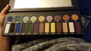
Since there are two finishes in the palette, I'll break it down by that. My first impression is that this palette is huge. It's probably the length of my forearm, but wider. It's bulky. The packaging is "meh". It is the standard, cardboard, weighted palette. Not much excitement. The outside is in Kat's trademark handwriting, which is pretty, but again, nothing special. Let's get into the shades.


                                            THE MATTES:
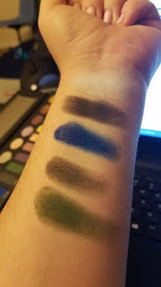
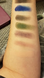
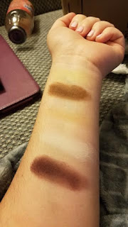
The mattes, on first glance, are pretty in color. They have a variety of neutrals and brights. However, they are HIGHLY disappointing in pigment. The swatches below had to be done four times to show up on my skin. Granted, I am a very fair girl, but I expect better from Kat (the pale queen herself, who is also ghostly and typically tries to cater to all skin tones).

I didn't bother with individual swatches in this post because, to be honest, I went through two separate times to take pictures and they just really didn't warrant individual photos. Most of them don't show up on my skin. They're patchy, inconsistent, and terrible. I dislike all the one's I didn't mark, but Ribbon, Silk, Fringe, Feather, and Velvet were atrocious. The colors Jet and Stone, the black and grey, almost look too similar. I was severely disappointed.


                     colors pictured below: Linen*, Jet, Velour, Stone, Moss (in order from L to R)

                                                        
       colors pictured below: Linen*, Jet, Velour, Stone, Moss, Ribbon, Silk (in order from L to R)
                                                        
colors pictured below: Linen*, Jet, Velour, Stone, Moss, Ribbon, Silk, Fringe, Feather (in order from L to R)
                                                        
                          colors pictured below: Oak*, Suede, Bone*, Velvet (in order from L to R)


                                                                                                         My favorites are marked with an (*)


METALS:
The glittery shades, the Metals, are overall pretty nice. The texture to the touch is soft and creamy. The darker colors were actually difficult to take off, and they do stain. As nice as they are, they are very inconsistent in pigmentation. 

While the color may be pretty, please be advised that these are swatched 3x, so it allowed for some consistency when layered. One swatch is not enough for the colors Glitz, Twinkle, and Volt. These were my least favorite of the bunch. 

colors pictured below: Nebula*, Watt*, Ignite*, Tinsel, Glitz (in order from L to R)

 colors pictured below: Tinsel, Glitz, Twinkle, Volt, Synergy*, Flash (in order from L to R)


          colors pictured below: Nebula*, Watt*, Ignite*, Tinsel, Glitz, Twinkle, Volt,       Synergy*, Flash (in order from L to R)


                                                                                                         My favorites are marked with an (*)


Makeup Wipe Showdown PT.1

Thursday, June 9, 2016

I'm a busy gal, (and I also get incredibly lazy), so makeup wipes are a staple in my life. From the days of high school, when I wasn't very educated in proper skincare and still had my baby face (when I almost never broke out), to the now post-college-graduate life where my stress seems to show on my face. Yikes @ #adultne. ANYWAY! I've found that over the years, I've tested a ton of some tried-and-true favorites, Here are some recent ones I've tested.

Let's have a looksies (images courtesy of google search):

I got these on a super clearance sale from a store closing, and I had bought tons of them. At first, I recall enjoying them, but as I started using them more, I disliked the feeling it gave my skin afterwards. I broke out a lot. This entire "fresh effects" line didn't drive me particularly crazy, to be fair. Overall, not a big fan, wouldn't repurchase.

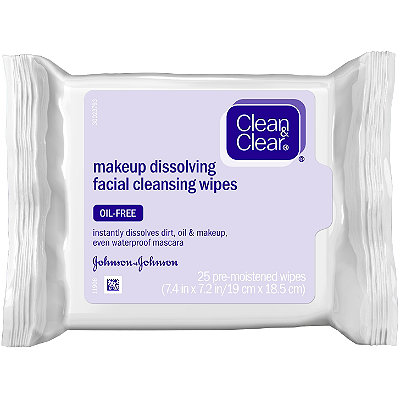
I did enjoy these Clean & Clear makeup wipes, as the ratio to moisture on the wipe to what actually stayed put on my face was good. It got off stubborn makeup, though I remember having to use a Q-TIP with more concentrated eye makeup remover to get off the stubborn stuff. Would repurchase.

Image result for yes to cucumbers makeup remover wipes
NO. These were awful. This product felt like it "dragged" my skin (pulling it due to the rough texture, which is not good around the ever-sensitive eye area). The product did not hold moisture for long. The smell drove me insane. The wipe itself was extremely light and did NOT remove stubborn makeup. I truthfully disliked every single aspect of this product, (p.s I tried ALL of their makeup wipe removers, against my better judgement, and they all were very similar).

This product was good for what it was--cheap. You can find this product in most stores on sale. With a quick search of this product, I found two places it was on sale. It's okay. It didn't do that great of a job, I had to go in with a cleansing water afterwards, but it wasn't terrible. The resealable pouch is the big con of this, as it's easier for it to drive out. If you're in a rush, go for it, but I don't think I would repurchase unless I could get it close to free.


Big surprise: I haven't found one I'm crazy about. I don't have a "go-to", but I'm always trying new things, and I have faith I'll find a must-have soon enough. I'm sure this will be a post that I will repeat as I try new ones.


Sephora 15% sale! (First swatches/impressions)

Wednesday, April 20, 2016

I got a Sephora box in the mail, and if you love makeup like I do, you know it feels like a true gift when that brown box is at your door.

Let's look inside, shall we?


The products I ordered were:
The Urban Decay Gwen Stefani Lipstick in 714
The Urban Decay Gwen Stefani 24/7 Glide-On Lip Pencil in 714
Guerlain Terracotta Bronzing Powder in Shade 1
Too Faced Sweethearts bronzer in Sweet Tea
Viseart Theory Palette in III Chroma

I'm going to attack the Gwen Stefani lip products by bunching them together. So let me prime by saying I had no interest when the collection came out. Gwen Stefani is very trendy, bright with "out-there" style in attire and in makeup. With that said, the shades in the collection just didn't strike me as a must-have for my stash. However, once on sale, I remembered swatching the above lip-pencil, and remembering that I enjoyed how it wore throughout the day. It recently went on sale, and in combination to the 15% off, I figured I'd grab it. The lipstick was also on sale, and I figured having it as well would be a nice addition.

I just love the wear of the lip pencil, and I find it much creamier and long-lasting than the lipstick. However, I really enjoy the color and I'm glad I picked it up.

After wearing it all night, I am in LOVE with the longevity of the lip product(s). It leaves a beautiful stain when the color rubs off (though, it has stayed on impressively.)

Guerlain just always gets it done for me. Their bronzers always strike me as beautiful, long-wearing and pigmented. I'm not as happy with the initial swatch of this, as it didn't really show up, but I plan to work with it tonight and update later on how buildable/pigmented it actually is.

*Update*
It's AMAZING. OH MY GOODNESS GRACIOUS. It gives the most gorgeous natural glow. I'm so in love with how it looks.

The Two Faced Sweet Tea duo swatches beautifully, and produces results accordingly. I pretty much covet everything that Too Faced comes out with..the packaging, the fair pricing, the great quality products. Nothing bad to say about this product. It preforms great. Both shades leave a sparkly hue. I used the lighter shade as a highlight under my brow bone, and the darker shade as a quick swipe over my cheekbones. Love the look it produced!

And, finally, the Viseart palette. If you want pigmentation, this palette packs a punch. It's gorgeous. Absolutely breath-taking. I'm so excited they paired these shades together to produce a lovely array of dynamic, every-day shades. I smoked out my lids in a quick five minute look, and it's a lot more effortless than it seems.

I got many compliments tonight on my makeup, and all I went out to was dinner and Barnes and Noble. Even my father, who is makeup inept, said he loved "the look" of the day. I used each product today, and I've got to say, all of them were AMAZING. I ate a greasy sandwich, drank juice, and talked consistently, and nothing has disappointed. I'm impressed, and certainly recommend all of the above products!

                                                       This packaging, though.:


Lip Pencil Color:


Lip liner closest to the wrist, lip stick on bottom:
(heavily swatched is the first, one swipe on the right)


So beautiful, such a warm color:


So cute, Too Faced. You reel me in again...:


Love the packaging on this palette:


Finished look (5 hours later):


Till Next Time! 


Update!

Sunday, February 7, 2016

So, it's been awhile.

I haven't really been playing with makeup much, due to a random and sudden loss in job. It really sucked, I'm sad about it, but I've moved on. I now have great perspectives on the horizon, and I'm genuinely feeling myself start to be happy again. With outer beauty comes the importance of inner beauty, and sometimes it suffers due to unfortunate circumstances. I can't wait to do what I love, which is play in the newest makeup and find gems to recommend.

I just picked up some goodies that I want to try to review soon. In addition to that, I've unearthed some products I haven't heard much talk about. I can't wait to get back into the swing of things!

Kathleen Lights and CoffeeBreakWithDani ColourPop Collabs!

Monday, June 22, 2015

I have two more Colourpop collabs to share today! The first is the Kathleen Lights palette.

I'd been eyeing this one for a bit, but hesitated to buy because 1) I didn't follow Kathleen, and 2) The colors didn't seem THAT much different than what I already had. However, I decided to splurge when I realized I had enough credit in my paypal account to cover this and the other bundle that I purchased.

The palette retails for $20 dollars, which equates to any other $5/1 eye shadow deal. I don't have the packaging to show you, as I threw it out after I used it..but it is gorgeous!

(not my image, courtesy of Google.com)

Disclaimer: I already used these shadows, only once, but I have used them. They had the lasting power of all of the other colourpop shades (amazing).

The first shade I reached for happened to be my favorite in the entire bunch. This is the "KathleenLights" shade, named after the collab/youtuber Kathleen.


I don't have anything bad to say about this shade. I used it in the center of the lid for a nice pop of metallic color. I love the shiny, almost wet look. No foiled shadows here! And it lasted. I loved this shade, a lot.


Next is the shade "Cornelious" (what a name!)


This shade was PERFECT as a transition color (in the crease). It has that perfect deep matte brown that every girl needs. The pigmentation on this one isn't as intense as the "Kathleen Lights" shade, but it's also matte. Thumbs up for a matte to complete the look!

The next shade is "Glow", and by far the most disappointing Colourpop shade I've owned to date. I almost hated it. I used it as a highlight, and while it looked great under the eyebrow, it didn't last at all. It also had this off consistency (you can see in the fourth photo below) that it almost seeps into the pores and creates a balled up effect. It's very, very odd. I own white/creams from Colourpop and they didn't have this odd sense of not blending in. I suppose it was just the formulation on this one. Definitely could have done without this one.


Last shade in the collection is "Blaze"


This olive green, taupe shade has major glitter. This color also has an off consistency, in my honest opinion. The glitters are a bit chunky. I do love the shade, and it wears on my blue eyes very nice. Paired with the "Cornelious", and really liked the depth it gave the look! This color wears a lot better than it swatches.

My Opinion On The KathleenLights Collab:
The colors in this collection are nice. With that said, I do not think they're anything unique or staple worthy. I'd perhaps appreciate these shades if I didn't own anything from Colourpop, or have anything similar, but these shades really aren't that unique to me. They do wear great, aside from Glow, which was the real disappointment from the set. I cannot emphasis that when blending a shade, the color shouldn't ball up. To me, no eye shadow is worth working with if it's going to do that, because there are so many products out there that don't do that. I cannot see myself using Glow again, but I can see myself reaching for the others, especially KathleenLights, which was the real winner of this collab. I would save my money, or splurge for the "Mondays in Malibu" kit, which has the real different shades that I cannot live without. Also, a side note, I thought there was a burgundy shade in the kit (from the photo of the palette), which I think would have been even nicer to throw in there than two brown shades.


The next collection is CoffeeBreakWithDani's "Metamorphasis" Palette.
I don't watch CoffeeBreakWithDani, but when I saw the swatches of these colors, I knew I had to have them. These shades are marketed as being beautiful toppers of any base shade that you may already have on. I'm not sure if they meant just two shades out of the kit, but spoiler alert, only two work well as that over top transition..more on that later. On to the colors.

The first is "Bravery". 


Bravery is a rich cocoa brown. It's deep, and perfect for the outer V, or simply wanting to vamp things up. It's certainly pretty, but wasn't the color I loved, or even felt like I needed.

On the skin. It is described as a Matte, but I do like the subtle sheen.


The color I was most excited about, Kindness.


It's such a beautiful color in the pan. It's a blueish-grey, iridescent shadow that really makes my heart sing (when looking at it). It's nothing special on it's own, sadly, but expected (since it is a transition shade).

(Second shade down is Kindness. No real color payoff, just very glittery)

The next color is "Strength".


Strength, to me, seems like a mauvy-brown color in the pot. When swatched, it appears more of a honey brown color. Again, wasn't super excited about this color, especially when swatched. I think my disappointment starts at this point..

Finally, there's "Hope" 

An iridescent shimmer that reflects a purple/pink duochrome when moved. I love the shift of this one, but swatching it plain doesn't do anything at all for me. As noted, I wasn't entirely upset because I knew this shade would perform on top of another color (and it's by far my favorite when doubling)
(Last shade)

(Overview of all of the shades by themselves)

I then decided to swatch my arm with Black and Grey, for each color.

I swatched the colors in the respective order (Bravery, Kindness, Strength, Hope) on the black swatches. They appeared as below:

I did it again for the grey's, in the same order again.


So after pairing them with two different colors (that are essentially universal for putting a glitter or transition on top of), I was somewhat bummed. I didn't want to just do what any blogger does, and keep piling it on until it worked (who has time for that?!), this is the result of two layers of the colors o n top of it. I think it's extremely strange, and disappointing, that they market these products as colors you can put on top of any base..when they A) don't all work on top of a base and B) are disappointing when you do put them on top. I am SO incredibly disappointed with Kindness's turnout, because I was most excited about that shade, and it wasn't even pretty no matter what way I tried to work with it. I would suggest going with "Bae" from Colourpop, if the Blue/Grey/Purple hue is what your heart is after (it is one million times better, and you can pair that with a black!) "Hope" looked beautiful on top of both colors, and I have to say it was my takeaway from this palette. Definitely a huge blow to me, because I thought this palette would be a game changer, when really, I should have saved my money.

While the entirity of these two collabs are somewhat disappointing, Colourpop is an amazing brand, and I would recommend it any day of the week. I have especially high standards, considering I studied ingredients, witnessed an array of different pigmentation and depths of colors in beauty school, and more. I hold Colourpop to the same standards as I would with a high end brand, because they normally deliver exceptional results. I was disappointed with these shades, but I know they'll bounce back!

Till next time.


Theme by: Pish and Posh Designs